Bead Color Combinations: How to Choose Colors That Work
A practical way to choose bead colors: four color wheel schemes, the role of neutrals and metallics, a simple proportion rule and how bead finish changes what a color looks like.

Good bead color combinations rarely come from luck. They come from a few repeatable choices: where the colors sit on the color wheel, how much of each one is used, and how the finish of the bead changes what the eye sees. Once those three things are clear, picking beads for a bracelet or necklace becomes a quick decision instead of a guess.
The color wheel in bead terms
A standard color wheel arranges twelve hues in a ring. Three are primary (red, yellow, blue), three are secondary mixes (orange, green, violet), and six sit in between, such as blue-green or red-orange. The useful part for beading is the position of the hues, because the distance between two colors on the ring predicts how they behave side by side.
- Colors close together blend and feel calm.
- Colors far apart contrast and feel lively.
- Warm hues (red, orange, yellow) seem to come forward, while cool hues (green, blue, violet) seem to sit back.
Four schemes that work
| Scheme | How to build it | Effect | Example |
|---|---|---|---|
| Monochrome | One hue in several shades, from light to dark | Quiet and tidy; the easiest to get right | Pale blue, medium blue, navy |
| Analogous | Two or three hues next to each other on the wheel | Harmonious, with more movement than one hue | Teal, green, yellow-green |
| Complementary | Two hues directly opposite each other | Strong contrast; each color makes the other look brighter | Blue and orange, red and green |
| Triadic | Three hues spaced evenly around the wheel | Bold and playful; needs careful proportion | Red, yellow, blue |

A monochrome set is a good first exercise because nothing can clash. It works especially well for stacked stretch bracelets, where three strands in one color family read as a single piece. Complementary pairs are the reason seasonal palettes are so recognizable: the red and green of a holiday bead bracelet sit opposite each other on the wheel.
Value matters as much as hue
Value is how light or dark a color is. Two different hues of the same value, such as a medium red beside a medium green, can merge into a muddy band from a short distance, and a pattern disappears. Giving a design a clear light, a middle tone and a dark makes stripes and repeats readable. A quick check is to take a phone photo of the laid-out beads and switch it to black and white. If the beads turn into one even gray, the palette needs a lighter or darker member.
Neutrals and metallics
Neutrals are white, cream, gray, black, tan and brown. They do not appear on the color wheel, so they get along with every hue. In a strand they do three jobs: they give the eye a rest, they separate colors that would compete, and they let one bright color carry the design.
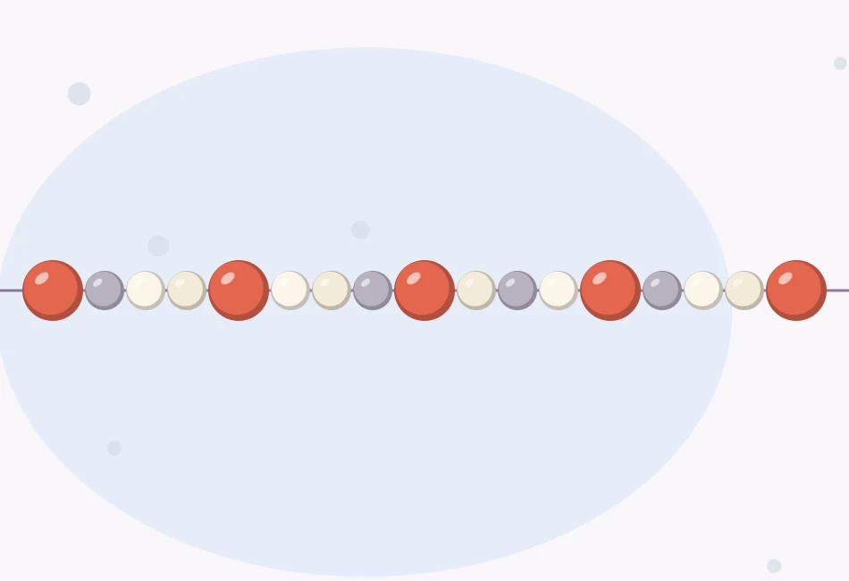
Metallic beads in gold, silver, copper or bronze tones behave like neutrals with shine. Gold tones lean warm and flatter reds, corals and greens. Silver tones lean cool and suit blues, violets and grays. A small metal spacer between two strong colors acts as a frame, and repeating one metal tone in the clasp and spacers ties a piece together.
Tip
When a palette feels too loud, do not remove a color first. Add a neutral between the colors and look again. Spacing colors apart often fixes what looked like a clash.
Proportion: dominant, secondary, accent
Equal amounts of every color tend to look restless. A dependable starting point is roughly 60 percent of a dominant color, 30 percent of a secondary color and 10 percent of an accent. The accent is usually the brightest, darkest or shiniest bead, used sparingly.
Here is how that looks in a real count. A 7 in (18 cm) strand of 6 mm round beads holds about 30 beads. Split 60, 30 and 10 percent, that is 18 dominant beads, 9 secondary beads and 3 accent beads, and 18 + 9 + 3 = 30. Arranged as a repeat of 6 dominant, 3 secondary and 1 accent, each repeat is 10 beads and measures 10 × 6 mm = 60 mm. Three repeats give 30 beads and 180 mm, which is about 7 in.
The same idea scales down to seed beads. A seed bead stretch bracelet with a striped repeat uses a main color for most of each block, a second color for the shorter block and single metallic beads as the accent.
How finish changes a color
Two beads sold as the same blue can look quite different once they are strung, because the surface and transparency change how light leaves the bead. The guide to types of beads covers materials; these are the finishes that affect color most.
- Opaque beads show solid, dependable color that looks the same on any thread and against any skin tone or fabric.
- Transparent beads let light through, so they look lighter and pick up the color of the cord inside them. White cord brightens them and dark cord deepens them.
- Matte or frosted beads scatter light, which softens a color and makes it appear slightly paler.
- Lined beads have a colored or metallic coating inside the hole, giving a glow from within.
- Metallic and iridescent coatings add reflections of other colors, so one bead may show blue, green and violet as it turns.
Watch out
Some dyed and coated beads can fade or rub off with wear, water or lotion. Ask the seller how the color was applied before buying a large quantity.
Test the palette before stringing
Colors in a tube or bag look denser and darker than the same beads spread out in a strand, so always lay them out first.
- Use a neutral surface. A gray or cream bead mat shows colors more truthfully than a bright table.
- Lay out at least two full repeats. One repeat hides how the end of the pattern meets its beginning.
- Look in daylight. Warm indoor bulbs shift blues and violets noticeably.
- Step back or squint. Jewelry is seen from a short distance, where small beads blend together.
- Swap one thing at a time. Change the accent, then the proportion, then the neutral, so it is clear which change helped.
If the combination looks wrong
- Flat and dull: add a lighter or darker value, or one metallic accent.
- Busy and tiring: cut back to three colors and increase the share of the dominant one.
- Pattern hard to see: replace one color with a much lighter or darker version.
Frequently asked questions
How many colors should a beaded bracelet have?
Two to four is a comfortable range for most designs: a dominant color, a secondary color, and one accent, with a neutral or a metal tone if the piece needs breathing room. More colors can work, but they need a clear dominant color to hold them together.
Which colors go with everything?
Neutrals such as white, cream, gray, black, tan and brown sit outside the color wheel and pair with any hue. Gold, silver, copper and bronze tones act as shiny neutrals; gold tones lean warm and silver tones lean cool.
Why do the beads look different once they are strung?
Beads packed together in a container look darker and more saturated than a single row. Transparent beads also pick up the color of the cord and whatever is behind them. Laying out two full repeats on a neutral mat in daylight gives a truer preview.
What is the 60-30-10 rule for beads?
It is a starting proportion: about 60 percent of a dominant color, 30 percent of a secondary color and 10 percent of an accent. In a 30-bead strand that works out to 18, 9 and 3 beads.